Session-5 Statistical Analysis and Data visualization
Statistical analysis and data visualization are integral pillars of modern data-driven decision-making and research. Statistical analysis involves the rigorous examination and interpretation of data, unveiling meaningful patterns, relationships, and insights that might otherwise remain hidden. It encompasses a wide array of techniques, from hypothesis testing and regression analysis to clustering and machine learning, allowing us to derive actionable conclusions from data.
Data visualization, is the art of representing data visually through charts, graphs, and interactive dashboards. It transforms raw numbers and statistics into intuitive, informative visuals that are accessible to both technical and non-technical audiences. Effective data visualization not only simplifies complex data but also provides a platform for exploration and discovery, enabling decision-makers to grasp insights at a glance.
Together, statistical analysis and data visualization form a symbiotic relationship. Statistical analysis generates the insights, while data visualization serves as the medium for conveying those insights. This powerful combination empowers individuals and organizations to extract valuable knowledge from vast datasets, make informed choices, and communicate findings with clarity and impact. In an era where data is abundant and essential, mastering these disciplines is key to harnessing the full potential of information for innovation, problem-solving, and informed decision-making across various domains, from business and healthcare to science and beyond.
5.1 Statistical Analysis
# Generate a sample dataset
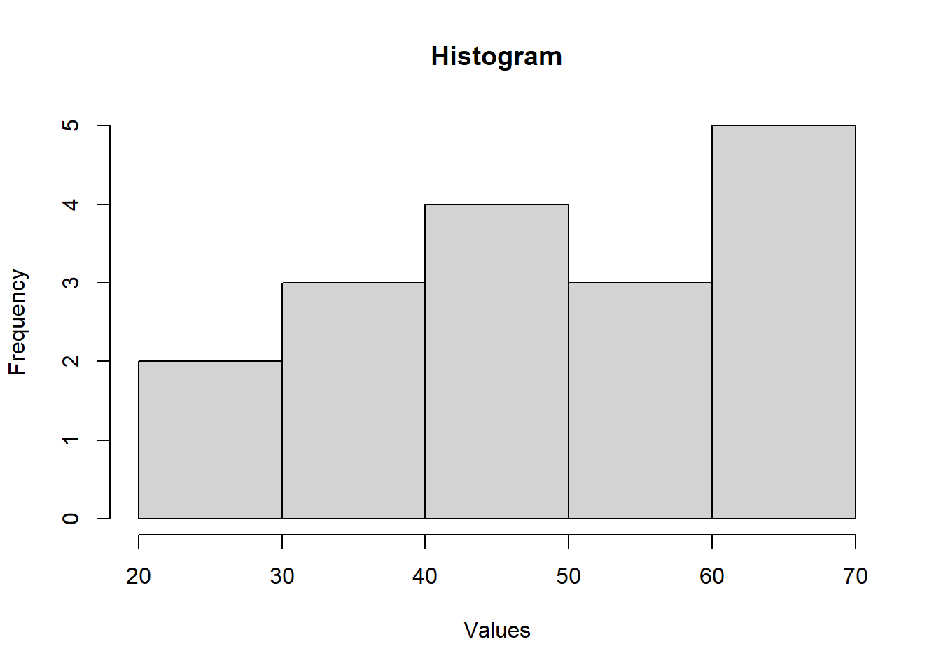
data <- data <- c(25, 30, 35, 40, 40, 45, 45, 50, 50, 55, 60, 60, 65, 70, 70, 70, 70)
# Calculate mean, median, and mode
mean_value <- mean(data)
median_value <- median(data)
mode_value <- as.numeric(names(sort(table(data), decreasing = TRUE)[1]))
# Calculate quartiles and percentiles
quartiles <- quantile(data, probs = c(0.25, 0.5, 0.75))
percentiles <- quantile(data, probs = c(0.25, 0.5, 0.75, 0.9))
# Create a box plot
boxplot(data, main = "Box Plot", ylab = "Values")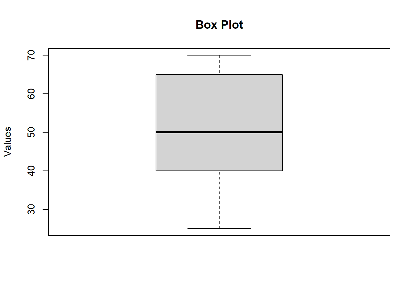
## Mean: 51.76## Median: 50## Mode: 70## Quartiles (Q1, Median, Q3): 40 50 65## Percentiles (25th, 50th, 75th, 90th): 40 50 65 70Variance : The variance measures the average degree to which each point differs from the mean.
\(\sigma^2 = \frac{1}{N} \sum_{i=1}^{N} (x_i - \mu)^2\)
Where:
\(\sigma^2\) -> Variance
N -> Number of Data points
\(x_i\) -> represents each individual data point.
\(\mu\) -> is the mean (average) of the data points.
Standard Deviation Standard deviation is the spread of a group of numbers from the mean.
\(\sigma = \sqrt{\sigma^2} = \sqrt{\frac{1}{N} \sum_{i=1}^{N} (x_i - \mu)^2}\)
Where:
\(\sigma\) -> Standard Deviation
\(\sigma^2\) -> Variance
N -> Number of Data points
\(x_i\) -> represents each individual data point.
\(\mu\) -> is the mean (average) of the data points.
Standard deviation is the square root of the variance, variance is the average of all data points within a group
# Calculate mean and standard deviation of variances
library(ggplot2)

calculate_variance <- function(data) {
  return(var(data))
}

set.seed(42)
num_samples <- 1000
sample_size <- 50
variances <- replicate(num_samples, calculate_variance(rnorm(sample_size)))

mean_variance <- mean(variances)
std_dev_variance <- sd(variances)

percentage_1st_sd <- round(sum(abs(variances - mean_variance) <= std_dev_variance) / length(variances) * 100, 2)
percentage_1st_sd
## [1] 68.7percentage_2nd_sd <- round(sum(abs(variances - mean_variance) <= 2 * std_dev_variance) / length(variances) * 100, 2)
percentage_2nd_sd## [1] 95.3percentage_3rd_sd <- round(sum(abs(variances - mean_variance) <= 3 * std_dev_variance) / length(variances) * 100, 2)
percentage_3rd_sd## [1] 99.8# Create a density plot of variances
ggplot(data = data.frame(Variance = variances), aes(x = Variance)) +
geom_density(fill = "blue", alpha = 0.5) +
labs(title = "Distribution of Variances",
x = "Variance",
y = "Density") +
geom_vline(xintercept = mean_variance - std_dev_variance, color = "red", linetype = "dashed") +
geom_vline(xintercept = mean_variance + std_dev_variance, color = "green", linetype = "dashed") +
geom_vline(xintercept = mean_variance - 2 * std_dev_variance, color = "orange", linetype = "dashed") +
geom_vline(xintercept = mean_variance + 2 * std_dev_variance, color = "purple", linetype = "dashed") +
geom_vline(xintercept = mean_variance - 3 * std_dev_variance, color = "brown", linetype = "dashed") +
geom_vline(xintercept = mean_variance + 3 * std_dev_variance, color = "black", linetype = "dashed") +
geom_vline(xintercept = mean_variance, color = "blue", linetype = "dashed") +
annotate("text", x = mean_variance - std_dev_variance, y = 0.1, label = "1st Std Dev", color = "red") +
annotate("text", x = mean_variance + std_dev_variance, y = 0.1, label = "1st Std Dev", color = "green") +
annotate("text", x = mean_variance - 2 * std_dev_variance, y = 0.1, label = "2nd Std Dev", color = "orange") +
annotate("text", x = mean_variance + 2 * std_dev_variance, y = 0.1, label = "2nd Std Dev", color = "purple") +
annotate("text", x = mean_variance - 3 * std_dev_variance, y = 0.1, label = "3rd Std Dev", color = "brown") +
annotate("text", x = mean_variance + 3 * std_dev_variance, y = 0.1, label = "3rd Std Dev", color = "black") +
annotate("text", x = mean_variance, y = 0.1, label = "Mean", color = "blue")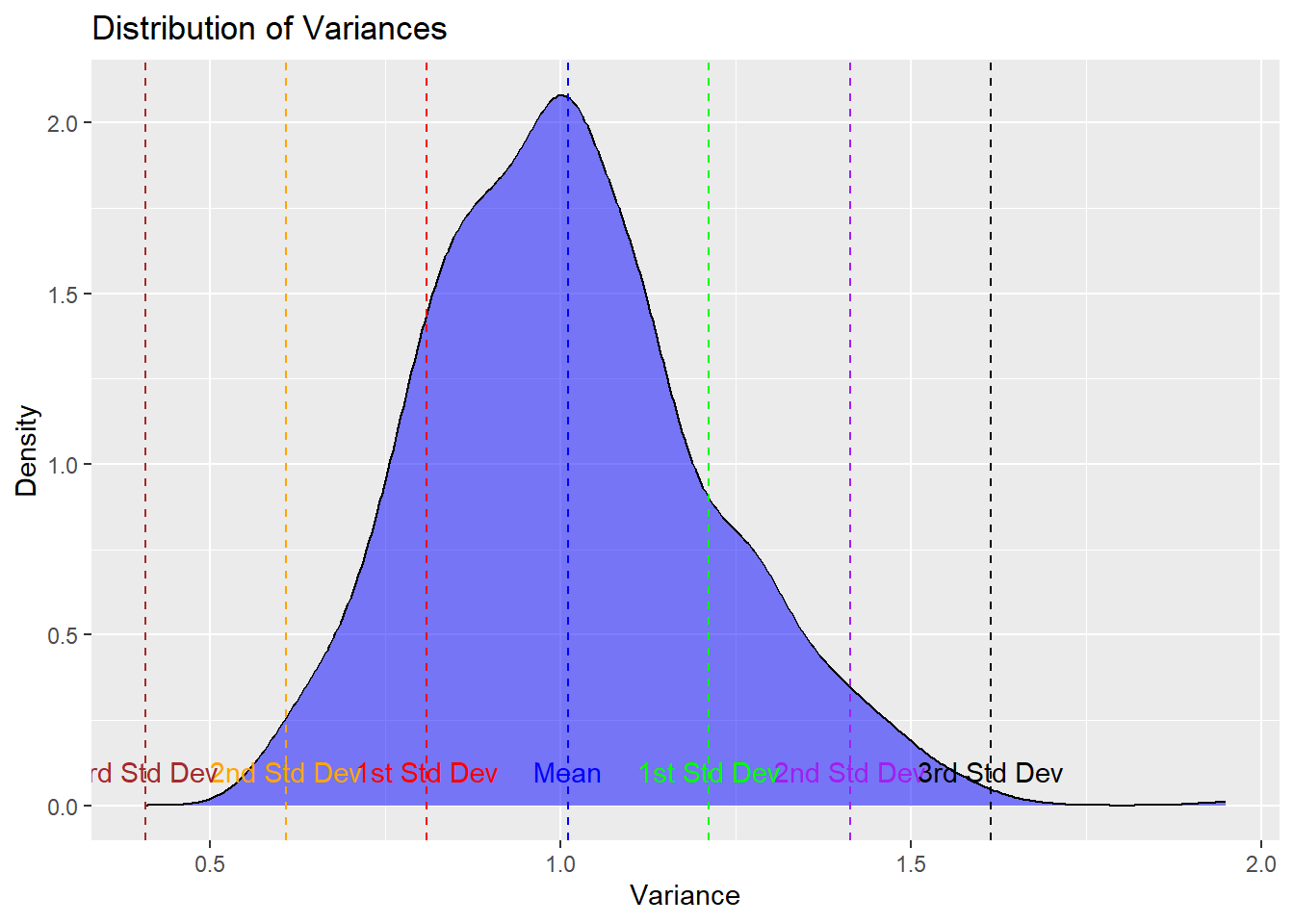
Lets get into some action
5.1.1 Analysis in practise
We’re going to start by operating on the
birthwtdataset from the MASS libraryLet’s get it loaded and see what we’re working with. Remember, loading the MASS library overrides certain tidyverse functions. We don’t want to do that. So when we need something from MASS we’ll extract that dataset or function directly.
tibbles
- tibbles are nicer data frames
- You may find it more convenient to work with tibbles instead of data frames
- In particular, they have nicer and more informative default print settings
- The dplyr functions we’ve been using are very nice because they map tibbles to other tibbles.
## # A tibble: 189 × 10
##      low   age   lwt  race smoke   ptl    ht    ui
##    <int> <int> <int> <int> <int> <int> <int> <int>
##  1     0    19   182     2     0     0     0     1
##  2     0    33   155     3     0     0     0     0
##  3     0    20   105     1     1     0     0     0
##  4     0    21   108     1     1     0     0     1
##  5     0    18   107     1     1     0     0     1
##  6     0    21   124     3     0     0     0     0
##  7     0    22   118     1     0     0     0     0
##  8     0    17   103     3     0     0     0     0
##  9     0    29   123     1     1     0     0     0
## 10     0    26   113     1     1     0     0     0
## # ℹ 179 more rows
## # ℹ 2 more variables: ftv <int>, bwt <int>## low age lwt race smoke ptl ht ui ftv bwt
## 85 0 19 182 2 0 0 0 1 0 2523
## 86 0 33 155 3 0 0 0 0 3 2551
## 87 0 20 105 1 1 0 0 0 1 2557
## 88 0 21 108 1 1 0 0 1 2 2594
## 89 0 18 107 1 1 0 0 1 0 2600
## 91 0 21 124 3 0 0 0 0 0 2622
## 92 0 22 118 1 0 0 0 0 1 2637
## 93 0 17 103 3 0 0 0 0 1 2637
## 94 0 29 123 1 1 0 0 0 1 2663
## 95 0 26 113 1 1 0 0 0 0 2665
## 96 0 19 95 3 0 0 0 0 0 2722
## 97 0 19 150 3 0 0 0 0 1 2733
## 98 0 22 95 3 0 0 1 0 0 2751
## 99 0 30 107 3 0 1 0 1 2 2750
## 100 0 18 100 1 1 0 0 0 0 2769
## 101 0 18 100 1 1 0 0 0 0 2769
## 102 0 15 98 2 0 0 0 0 0 2778
## 103 0 25 118 1 1 0 0 0 3 2782
## 104 0 20 120 3 0 0 0 1 0 2807
## 105 0 28 120 1 1 0 0 0 1 2821
## 106 0 32 121 3 0 0 0 0 2 2835
## 107 0 31 100 1 0 0 0 1 3 2835
## 108 0 36 202 1 0 0 0 0 1 2836
## 109 0 28 120 3 0 0 0 0 0 2863
## 111 0 25 120 3 0 0 0 1 2 2877
## 112 0 28 167 1 0 0 0 0 0 2877
## 113 0 17 122 1 1 0 0 0 0 2906
## 114 0 29 150 1 0 0 0 0 2 2920
## 115 0 26 168 2 1 0 0 0 0 2920
## 116 0 17 113 2 0 0 0 0 1 2920
## 117 0 17 113 2 0 0 0 0 1 2920
## 118 0 24 90 1 1 1 0 0 1 2948
## 119 0 35 121 2 1 1 0 0 1 2948
## 120 0 25 155 1 0 0 0 0 1 2977
## 121 0 25 125 2 0 0 0 0 0 2977
## 123 0 29 140 1 1 0 0 0 2 2977
## 124 0 19 138 1 1 0 0 0 2 2977
## 125 0 27 124 1 1 0 0 0 0 2922
## 126 0 31 215 1 1 0 0 0 2 3005
## 127 0 33 109 1 1 0 0 0 1 3033
## 128 0 21 185 2 1 0 0 0 2 3042
## 129 0 19 189 1 0 0 0 0 2 3062
## 130 0 23 130 2 0 0 0 0 1 3062
## 131 0 21 160 1 0 0 0 0 0 3062
## 132 0 18 90 1 1 0 0 1 0 3062
## 133 0 18 90 1 1 0 0 1 0 3062
## 134 0 32 132 1 0 0 0 0 4 3080
## 135 0 19 132 3 0 0 0 0 0 3090
## 136 0 24 115 1 0 0 0 0 2 3090
## 137 0 22 85 3 1 0 0 0 0 3090
## 138 0 22 120 1 0 0 1 0 1 3100
## 139 0 23 128 3 0 0 0 0 0 3104
## 140 0 22 130 1 1 0 0 0 0 3132
## 141 0 30 95 1 1 0 0 0 2 3147
## 142 0 19 115 3 0 0 0 0 0 3175
## 143 0 16 110 3 0 0 0 0 0 3175
## 144 0 21 110 3 1 0 0 1 0 3203
## 145 0 30 153 3 0 0 0 0 0 3203
## 146 0 20 103 3 0 0 0 0 0 3203
## 147 0 17 119 3 0 0 0 0 0 3225
## 148 0 17 119 3 0 0 0 0 0 3225
## 149 0 23 119 3 0 0 0 0 2 3232
## 150 0 24 110 3 0 0 0 0 0 3232
## 151 0 28 140 1 0 0 0 0 0 3234
## 154 0 26 133 3 1 2 0 0 0 3260
## 155 0 20 169 3 0 1 0 1 1 3274
## 156 0 24 115 3 0 0 0 0 2 3274
## 159 0 28 250 3 1 0 0 0 6 3303
## 160 0 20 141 1 0 2 0 1 1 3317
## 161 0 22 158 2 0 1 0 0 2 3317
## 162 0 22 112 1 1 2 0 0 0 3317
## 163 0 31 150 3 1 0 0 0 2 3321
## 164 0 23 115 3 1 0 0 0 1 3331
## 166 0 16 112 2 0 0 0 0 0 3374
## 167 0 16 135 1 1 0 0 0 0 3374
## 168 0 18 229 2 0 0 0 0 0 3402
## 169 0 25 140 1 0 0 0 0 1 3416
## 170 0 32 134 1 1 1 0 0 4 3430
## 172 0 20 121 2 1 0 0 0 0 3444
## 173 0 23 190 1 0 0 0 0 0 3459
## 174 0 22 131 1 0 0 0 0 1 3460
## 175 0 32 170 1 0 0 0 0 0 3473
## 176 0 30 110 3 0 0 0 0 0 3544
## 177 0 20 127 3 0 0 0 0 0 3487
## 179 0 23 123 3 0 0 0 0 0 3544
## 180 0 17 120 3 1 0 0 0 0 3572
## 181 0 19 105 3 0 0 0 0 0 3572
## 182 0 23 130 1 0 0 0 0 0 3586
## 183 0 36 175 1 0 0 0 0 0 3600
## 184 0 22 125 1 0 0 0 0 1 3614
## 185 0 24 133 1 0 0 0 0 0 3614
## 186 0 21 134 3 0 0 0 0 2 3629
## 187 0 19 235 1 1 0 1 0 0 3629
## 188 0 25 95 1 1 3 0 1 0 3637
## 189 0 16 135 1 1 0 0 0 0 3643
## 190 0 29 135 1 0 0 0 0 1 3651
## 191 0 29 154 1 0 0 0 0 1 3651
## 192 0 19 147 1 1 0 0 0 0 3651
## 193 0 19 147 1 1 0 0 0 0 3651
## 195 0 30 137 1 0 0 0 0 1 3699
## 196 0 24 110 1 0 0 0 0 1 3728
## 197 0 19 184 1 1 0 1 0 0 3756
## 199 0 24 110 3 0 1 0 0 0 3770
## 200 0 23 110 1 0 0 0 0 1 3770
## 201 0 20 120 3 0 0 0 0 0 3770
## 202 0 25 241 2 0 0 1 0 0 3790
## 203 0 30 112 1 0 0 0 0 1 3799
## 204 0 22 169 1 0 0 0 0 0 3827
## 205 0 18 120 1 1 0 0 0 2 3856
## 206 0 16 170 2 0 0 0 0 4 3860
## 207 0 32 186 1 0 0 0 0 2 3860
## 208 0 18 120 3 0 0 0 0 1 3884
## 209 0 29 130 1 1 0 0 0 2 3884
## 210 0 33 117 1 0 0 0 1 1 3912
## 211 0 20 170 1 1 0 0 0 0 3940
## 212 0 28 134 3 0 0 0 0 1 3941
## 213 0 14 135 1 0 0 0 0 0 3941
## 214 0 28 130 3 0 0 0 0 0 3969
## 215 0 25 120 1 0 0 0 0 2 3983
## 216 0 16 95 3 0 0 0 0 1 3997
## 217 0 20 158 1 0 0 0 0 1 3997
## 218 0 26 160 3 0 0 0 0 0 4054
## 219 0 21 115 1 0 0 0 0 1 4054
## 220 0 22 129 1 0 0 0 0 0 4111
## 221 0 25 130 1 0 0 0 0 2 4153
## 222 0 31 120 1 0 0 0 0 2 4167
## 223 0 35 170 1 0 1 0 0 1 4174
## 224 0 19 120 1 1 0 0 0 0 4238
## 225 0 24 116 1 0 0 0 0 1 4593
## 226 0 45 123 1 0 0 0 0 1 4990
## 4 1 28 120 3 1 1 0 1 0 709
## 10 1 29 130 1 0 0 0 1 2 1021
## 11 1 34 187 2 1 0 1 0 0 1135
## 13 1 25 105 3 0 1 1 0 0 1330
## 15 1 25 85 3 0 0 0 1 0 1474
## 16 1 27 150 3 0 0 0 0 0 1588
## 17 1 23 97 3 0 0 0 1 1 1588
## 18 1 24 128 2 0 1 0 0 1 1701
## 19 1 24 132 3 0 0 1 0 0 1729
## 20 1 21 165 1 1 0 1 0 1 1790
## 22 1 32 105 1 1 0 0 0 0 1818
## 23 1 19 91 1 1 2 0 1 0 1885
## 24 1 25 115 3 0 0 0 0 0 1893
## 25 1 16 130 3 0 0 0 0 1 1899
## 26 1 25 92 1 1 0 0 0 0 1928
## 27 1 20 150 1 1 0 0 0 2 1928
## 28 1 21 200 2 0 0 0 1 2 1928
## 29 1 24 155 1 1 1 0 0 0 1936
## 30 1 21 103 3 0 0 0 0 0 1970
## 31 1 20 125 3 0 0 0 1 0 2055
## 32 1 25 89 3 0 2 0 0 1 2055
## 33 1 19 102 1 0 0 0 0 2 2082
## 34 1 19 112 1 1 0 0 1 0 2084
## 35 1 26 117 1 1 1 0 0 0 2084
## 36 1 24 138 1 0 0 0 0 0 2100
## 37 1 17 130 3 1 1 0 1 0 2125
## 40 1 20 120 2 1 0 0 0 3 2126
## 42 1 22 130 1 1 1 0 1 1 2187
## 43 1 27 130 2 0 0 0 1 0 2187
## 44 1 20 80 3 1 0 0 1 0 2211
## 45 1 17 110 1 1 0 0 0 0 2225
## 46 1 25 105 3 0 1 0 0 1 2240
## 47 1 20 109 3 0 0 0 0 0 2240
## 49 1 18 148 3 0 0 0 0 0 2282
## 50 1 18 110 2 1 1 0 0 0 2296
## 51 1 20 121 1 1 1 0 1 0 2296
## 52 1 21 100 3 0 1 0 0 4 2301
## 54 1 26 96 3 0 0 0 0 0 2325
## 56 1 31 102 1 1 1 0 0 1 2353
## 57 1 15 110 1 0 0 0 0 0 2353
## 59 1 23 187 2 1 0 0 0 1 2367
## 60 1 20 122 2 1 0 0 0 0 2381
## 61 1 24 105 2 1 0 0 0 0 2381
## 62 1 15 115 3 0 0 0 1 0 2381
## 63 1 23 120 3 0 0 0 0 0 2410
## 65 1 30 142 1 1 1 0 0 0 2410
## 67 1 22 130 1 1 0 0 0 1 2410
## 68 1 17 120 1 1 0 0 0 3 2414
## 69 1 23 110 1 1 1 0 0 0 2424
## 71 1 17 120 2 0 0 0 0 2 2438
## 75 1 26 154 3 0 1 1 0 1 2442
## 76 1 20 105 3 0 0 0 0 3 2450
## 77 1 26 190 1 1 0 0 0 0 2466
## 78 1 14 101 3 1 1 0 0 0 2466
## 79 1 28 95 1 1 0 0 0 2 2466
## 81 1 14 100 3 0 0 0 0 2 2495
## 82 1 23 94 3 1 0 0 0 0 2495
## 83 1 17 142 2 0 0 1 0 0 2495
## 84 1 21 130 1 1 0 1 0 3 2495- There are a few ways in which operations on tibbles behave differently from operations on data frames. This occurs, for instance, with certain types of indexing:
##   [1] 19 33 20 21 18 21 22 17 29 26 19 19 22 30 18 18
##  [17] 15 25 20 28 32 31 36 28 25 28 17 29 26 17 17 24
##  [33] 35 25 25 29 19 27 31 33 21 19 23 21 18 18 32 19
##  [49] 24 22 22 23 22 30 19 16 21 30 20 17 17 23 24 28
##  [65] 26 20 24 28 20 22 22 31 23 16 16 18 25 32 20 23
##  [81] 22 32 30 20 23 17 19 23 36 22 24 21 19 25 16 29
##  [97] 29 19 19 30 24 19 24 23 20 25 30 22 18 16 32 18
## [113] 29 33 20 28 14 28 25 16 20 26 21 22 25 31 35 19
## [129] 24 45 28 29 34 25 25 27 23 24 24 21 32 19 25 16
## [145] 25 20 21 24 21 20 25 19 19 26 24 17 20 22 27 20
## [161] 17 25 20 18 18 20 21 26 31 15 23 20 24 15 23 30
## [177] 22 17 23 17 26 20 26 14 28 14 23 17 21## [1] 19 33 20 21 18 21 22 17 29 26 19 19 22 30 18 18
## [17] 15 25 20 28 32 31 36 28 25 28 17 29 26 17 17 24
## [33] 35 25 25 29 19 27 31 33 21 19 23 21 18 18 32 19
## [49] 24 22 22 23 22 30 19 16 21 30 20 17 17 23 24 28
## [65] 26 20 24 28 20 22 22 31 23 16 16 18 25 32 20 23
## [81] 22 32 30 20 23 17 19 23 36 22 24 21 19 25 16 29
## [97] 29 19 19 30 24 19 24 23 20 25 30 22 18 16 32 18
## [113] 29 33 20 28 14 28 25 16 20 26 21 22 25 31 35 19
## [129] 24 45 28 29 34 25 25 27 23 24 24 21 32 19 25 16
## [145] 25 20 21 24 21 20 25 19 19 26 24 17 20 22 27 20
## [161] 17 25 20 18 18 20 21 26 31 15 23 20 24 15 23 30
## [177] 22 17 23 17 26 20 26 14 28 14 23 17 21## [1] 19## # A tibble: 1 × 1
## age
## <int>
## 1 19## [1] 19Note: If you want to import data directly into
tibbleformat, you may useread_delim()andread_csv()instead of their base-R alternatives. Even though we started with the base alternatives, I recommend using these improved import commands going forward.
5.1.2 Renaming the variables
The dataset doesn’t come with very descriptive variable names
Let’s get better column names (use
help(birthwt)to understand the variables and come up with better names)
##  [1] "low"   "age"   "lwt"   "race"  "smoke" "ptl"
##  [7] "ht"    "ui"    "ftv"   "bwt"
# The default names are not very descriptive
colnames(birthwt) <- c("birthwt.below.2500", "mother.age",
"mother.weight", "race", "mother.smokes",
"previous.prem.labor", "hypertension",
"uterine.irr", "physician.visits", "birthwt.grams")
# Better names!
birthwt## # A tibble: 189 × 10
## birthwt.below.2500 mother.age mother.weight race
## <int> <int> <int> <int>
## 1 0 19 182 2
## 2 0 33 155 3
## 3 0 20 105 1
## 4 0 21 108 1
## 5 0 18 107 1
## 6 0 21 124 3
## 7 0 22 118 1
## 8 0 17 103 3
## 9 0 29 123 1
## 10 0 26 113 1
## # ℹ 179 more rows
## # ℹ 6 more variables: mother.smokes <int>,
## # previous.prem.labor <int>, hypertension <int>,
## # uterine.irr <int>, physician.visits <int>,
## # birthwt.grams <int>5.1.3 An alternative renaming approach: the rename() command
rename operates by allowing you to specify a new variable name for whichever old variable name you want to change.
# Reload the data again
birthwt <- as_tibble(MASS::birthwt)
birthwt <- birthwt %>%
rename(birthwt.below.2500 = low,
mother.age = age,
mother.weight = lwt,
mother.smokes = smoke,
previous.prem.labor = ptl,
hypertension = ht,
uterine.irr = ui,
physician.visits = ftv,
birthwt.grams = bwt)
colnames(birthwt)## [1] "birthwt.below.2500" "mother.age"
## [3] "mother.weight" "race"
## [5] "mother.smokes" "previous.prem.labor"
## [7] "hypertension" "uterine.irr"
## [9] "physician.visits" "birthwt.grams"## # A tibble: 189 × 10
## birthwt.below.2500 mother.age mother.weight race
## <int> <int> <int> <int>
## 1 0 19 182 2
## 2 0 33 155 3
## 3 0 20 105 1
## 4 0 21 108 1
## 5 0 18 107 1
## 6 0 21 124 3
## 7 0 22 118 1
## 8 0 17 103 3
## 9 0 29 123 1
## 10 0 26 113 1
## # ℹ 179 more rows
## # ℹ 6 more variables: mother.smokes <int>,
## # previous.prem.labor <int>, hypertension <int>,
## # uterine.irr <int>, physician.visits <int>,
## # birthwt.grams <int>Note that in this command we didn’t rename the race variable because it already had a good name.
5.1.4 Renaming the factors
All the factors are currently represented as integers
Let’s use the
mutate(),mutate_at()andrecode_factor()functions to convert variables to factors and give the factors more meaningful levels
## # A tibble: 189 × 10
##    birthwt.below.2500 mother.age mother.weight  race
##                 <int>      <int>         <int> <int>
##  1                  0         19           182     2
##  2                  0         33           155     3
##  3                  0         20           105     1
##  4                  0         21           108     1
##  5                  0         18           107     1
##  6                  0         21           124     3
##  7                  0         22           118     1
##  8                  0         17           103     3
##  9                  0         29           123     1
## 10                  0         26           113     1
## # ℹ 179 more rows
## # ℹ 6 more variables: mother.smokes <int>,
## #   previous.prem.labor <int>, hypertension <int>,
## #   uterine.irr <int>, physician.visits <int>,
## # birthwt.grams <int>birthwt <- birthwt %>%
mutate(race = recode_factor(race, `1` = "white", `2` = "black", `3` = "other")) %>%
mutate_at(c("mother.smokes", "hypertension", "uterine.irr", "birthwt.below.2500"),
~ recode_factor(.x, `0` = "no", `1` = "yes"))
birthwt## # A tibble: 189 × 10
## birthwt.below.2500 mother.age mother.weight race
## <fct> <int> <int> <fct>
## 1 no 19 182 black
## 2 no 33 155 other
## 3 no 20 105 white
## 4 no 21 108 white
## 5 no 18 107 white
## 6 no 21 124 other
## 7 no 22 118 white
## 8 no 17 103 other
## 9 no 29 123 white
## 10 no 26 113 white
## # ℹ 179 more rows
## # ℹ 6 more variables: mother.smokes <fct>,
## # previous.prem.labor <int>, hypertension <fct>,
## # uterine.irr <fct>, physician.visits <int>,
## # birthwt.grams <int>Recall that the syntax ~ recode_factor(.x, ...) defines an anonymous function that will be applied to every column specfied in the first part of the mutate_at() call. In this case, all of the specified variables are binary 0/1 coded, and are being recoded to no/yes.
Summary of the data - Now that things are coded correctly, we can look at an overall summary
## birthwt.below.2500 mother.age mother.weight
## no :130 Min. :14.0 Min. : 80
## yes: 59 1st Qu.:19.0 1st Qu.:110
## Median :23.0 Median :121
## Mean :23.2 Mean :130
## 3rd Qu.:26.0 3rd Qu.:140
## Max. :45.0 Max. :250
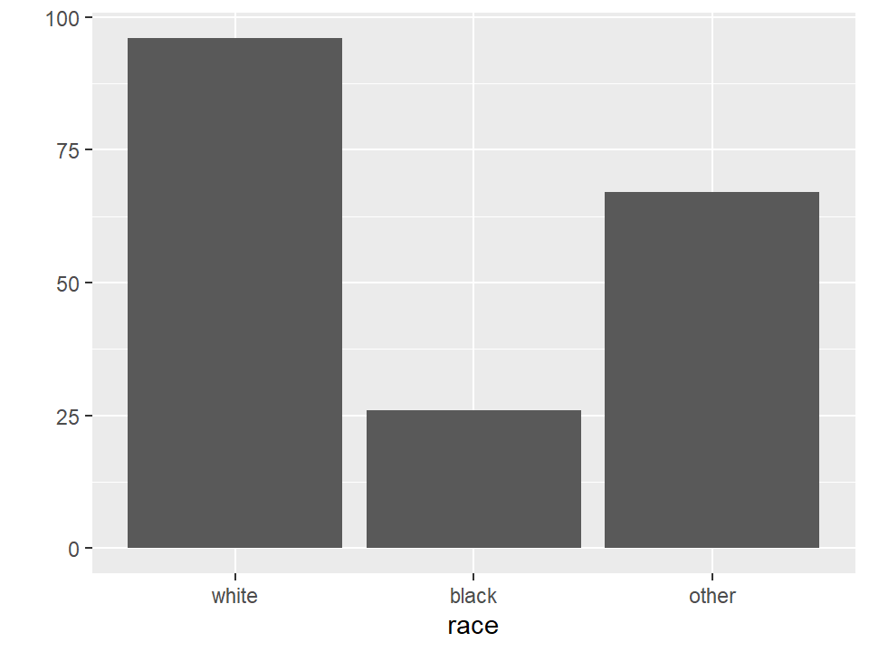
## race mother.smokes previous.prem.labor
## white:96 no :115 Min. :0.000
## black:26 yes: 74 1st Qu.:0.000
## other:67 Median :0.000
## Mean :0.196
## 3rd Qu.:0.000
## Max. :3.000
## hypertension uterine.irr physician.visits
## no :177 no :161 Min. :0.000
## yes: 12 yes: 28 1st Qu.:0.000
## Median :0.000
## Mean :0.794
## 3rd Qu.:1.000
## Max. :6.000
## birthwt.grams
## Min. : 709
## 1st Qu.:2414
## Median :2977
## Mean :2945
## 3rd Qu.:3487
## Max. :4990A simple table
- Let’s use the summarize() and group_by() functions to see what the average birthweight looks like when broken down by race and smoking status. To make the printout nicer we’ll round to the nearest gram.
tbl.mean.bwt <- birthwt %>%
  group_by(race, mother.smokes) %>%
  summarize(mean.birthwt = round(mean(birthwt.grams), 0))
## `summarise()` has grouped output by 'race'. You can
## override using the `.groups` argument.## # A tibble: 6 × 3
## # Groups: race [3]
## race mother.smokes mean.birthwt
## <fct> <fct> <dbl>
## 1 white no 3429
## 2 white yes 2827
## 3 black no 2854
## 4 black yes 2504
## 5 other no 2816
## 6 other yes 2757- Questions you should be asking yourself:
- Does smoking status appear to have an effect on birth weight?
- Does the effect of smoking status appear to be consistent across racial groups?
- What is the association between race and birth weight?
A simple reshape
- Some of these questions might be easier if we had the data in a wide rather than a long format. Here’s how we can do that with the
pivot_wider()function fromtidyr - In previous versions of
tidyrthis would have been achieved through thespread()functionspread()still works, but the new preferred call is topivot_wider()
- To use
pivot_wider()for this type of reshaping, we’ll want to specify thedata,names_fromandvalues_from:
## # A tibble: 3 × 3
## # Groups: race [3]
## race no yes
## <fct> <dbl> <dbl>
## 1 white 3429 2827
## 2 black 2854 2504
## 3 other 2816 2757What if we wanted nicer looking output?
- Let’s use the header {r, results='asis'}, along with the kable() function from the knitr library
- We could save the table from our previous computation and then run
kableon it directly with akable(x, format)command. Or, we can take our table code from before, and pipe it into a kable command.- Either approach is fine
tbl.mean.bwt %>%
pivot_wider(names_from = mother.smokes, values_from = mean.birthwt) %>%
kable(format = "markdown")| race | no | yes |
|---|---|---|
| white | 3429 | 2827 |
| black | 2854 | 2504 |
| other | 2816 | 2757 |
kable()outputs the table in a way that Markdown can read and nicely displayNote: changing the CSS changes the table appearance
Example: Association between mother’s age and birth weight?
# Load required libraries
library(dplyr)
library(ggplot2)

# Load the birthwt dataset (assuming it's available in your R environment)
data(birthwt)
## Warning in data(birthwt): data set 'birthwt' not found# Calculate the correlation matrix for selected variables
correlations <- cor(birthwt[, c("mother.age", "mother.weight","birthwt.grams")])
# Convert the correlation matrix to a data frame for plotting
cor_df <- as.data.frame(as.table(correlations))
colnames(cor_df) <- c("Variable1", "Variable2", "Correlation")
# Visualize the correlation matrix as a heatmap
ggplot(data = cor_df, aes(x = Variable1, y = Variable2, fill = Correlation)) +
geom_tile() +
scale_fill_gradient2(low = "red", mid = "white", high = "blue", midpoint = 0) +
labs(title = "Correlation Heatmap") +
theme_minimal() +
theme(axis.text.x = element_text(angle = 45, hjust = 1))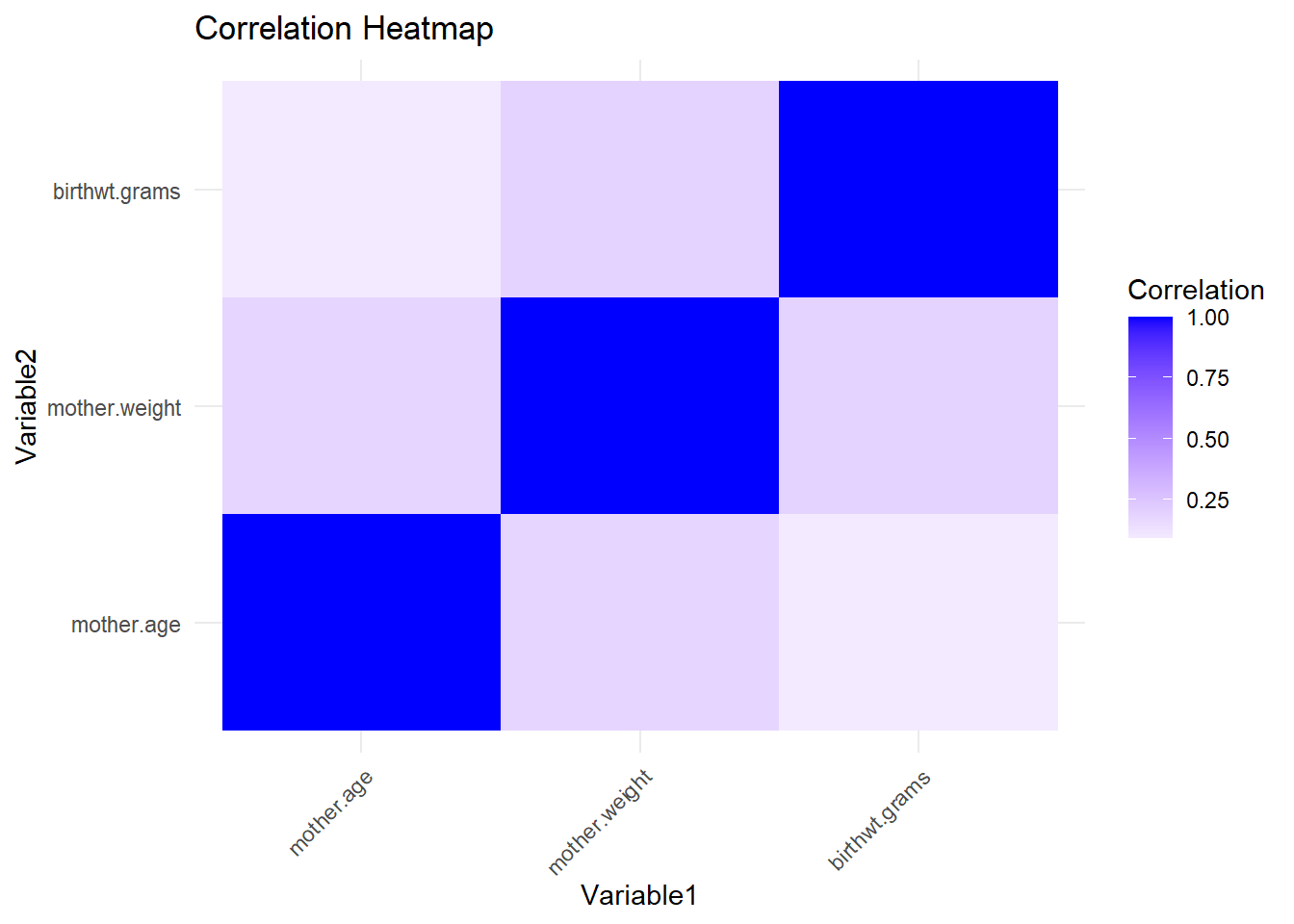
Analyse Correlations
Is the mother’s age correlated with birth weight?
## [1] 0.09032Does the correlation vary with smoking status?
## # A tibble: 2 × 2
##   mother.smokes cor_bwt_age
##   <fct>               <dbl>
## 1 no                  0.201
## 2 yes                -0.144
Does the association between birthweight and mother’s age vary by race?
## # A tibble: 3 × 2
##   race  cor_bwt_age
##   <fct>       <dbl>
## 1 white      0.166
## 2 black     -0.329
## 3 other     -0.0293
There does look to be variation, but we don’t know if it’s statistically significant without further investigation.
5.2 Visualization in R
We now know a lot about how to tabulate data
It’s often easier to look at plots instead of tables
We’ll now talk about some of the standard plotting options
5.2.1 Single-variable plots
Let’s continue with the birthwt data from the MASS library.
Here are some basic single-variable plots.
par(mfrow = c(2,2)) # Display plots in a single 2 x 2 figure
plot(birthwt$mother.age)
with(birthwt, hist(mother.age))
plot(birthwt$mother.smokes)
plot(birthwt$birthwt.grams)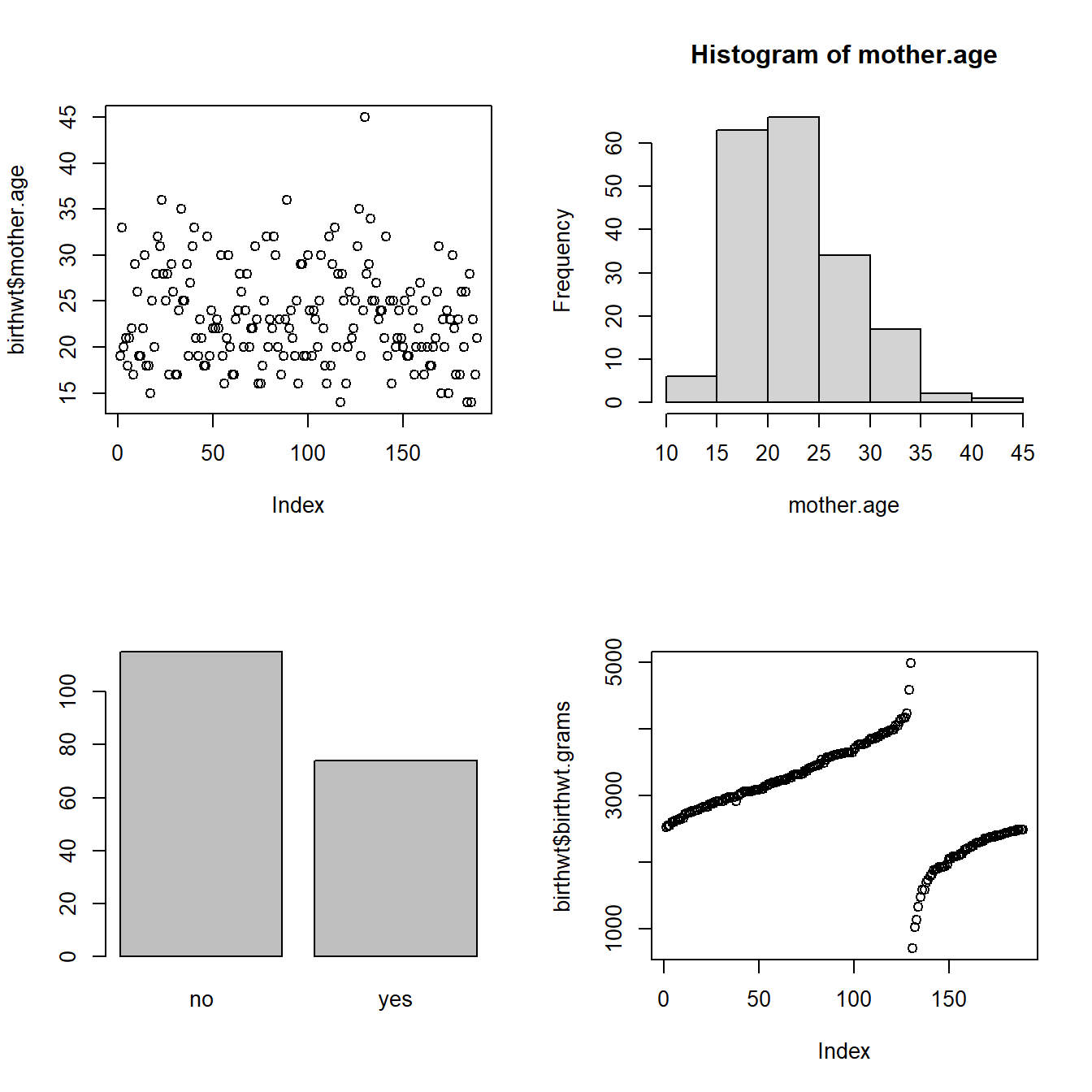
Note that the result of calling plot(x, ...) varies depending on what x is.
- When x is numeric, you get a plot showing the value of x at every index.
- When x is a factor, you get a bar plot of counts for every level
Let’s add more information to the smoking bar plot, and also change the color by setting the col option.
par(mfrow = c(1,1))
plot(birthwt$mother.smokes,
     main = "Mothers Who Smoked In Pregnancy",
     xlab = "Smoking during pregnancy",
     ylab = "Count of Mothers",
     col = "lightgrey")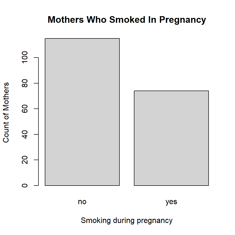
(much) better graphics with ggplot2
5.2.2 Introduction to ggplot2
ggplot2 has a slightly steeper learning curve than the base graphics functions, but it also generally produces far better and more easily customizable graphics.
There are two basic calls in ggplot:
qplot(x, y, ..., data): a “quick-plot” routine, which essentially replaces the baseplot()ggplot(data, aes(x, y, ...), ...): defines a graphics object from which plots can be generated, along with aesthetic mappings that specify how variables are mapped to visual properties.
5.2.3 plot vs qplot
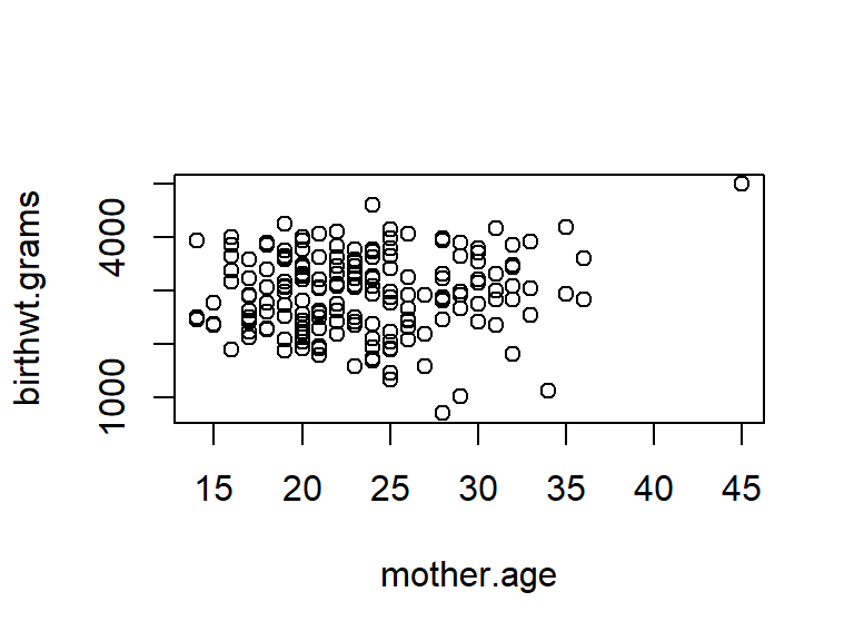
Here’s how the default scatterplots look in ggplot compared to the base graphics. We’ll illustrate things by continuing to use the birthwt data from the MASS library.
## Warning: `qplot()` was deprecated in ggplot2 3.4.0.
## This warning is displayed once every 8 hours.
## Call `lifecycle::last_lifecycle_warnings()` to see
## where this warning was generated.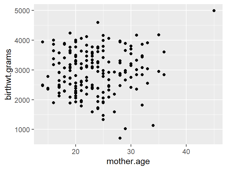
I’ve snuck the with() command into this example. with() allows you to use the variables in a data frame directly in evaluating the expression in the second argument.
Unlike base R graphics, which make things like legends a huge pain that requires a lot of manual work, ggplot2 automatically produces reasonable (and also highly customizable) legends. Here’s an example.
qplot(x=mother.age, y=birthwt.grams, data=birthwt,
      color = mother.smokes,
      shape = mother.smokes,
      xlab = "Mother's age (years)",
ylab = "Baby's birthweight (grams)") 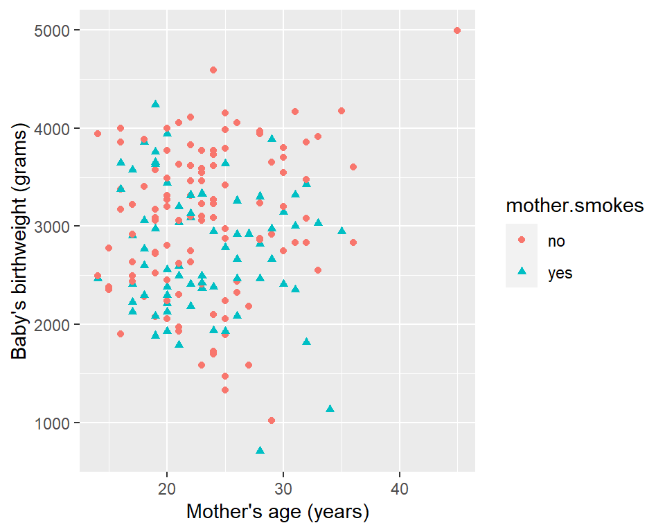
This way you won’t run into problems of accidentally producing the wrong legend. The legend is produced based on the colour and shape argument that you pass in. (Note: color and colour have the same effect. )
5.2.4 ggplot function
The ggplot2 library comes with a dataset called diamonds. Let’s look at it
## [1] 53940 10## # A tibble: 6 × 10
## carat cut color clarity depth table price x
## <dbl> <ord> <ord> <ord> <dbl> <dbl> <int> <dbl>
## 1 0.23 Ideal E SI2 61.5 55 326 3.95
## 2 0.21 Premium E SI1 59.8 61 326 3.89
## 3 0.23 Good E VS1 56.9 65 327 4.05
## 4 0.29 Premium I VS2 62.4 58 334 4.2
## 5 0.31 Good J SI2 63.3 58 335 4.34
## 6 0.24 Very Good J VVS2 62.8 57 336 3.94
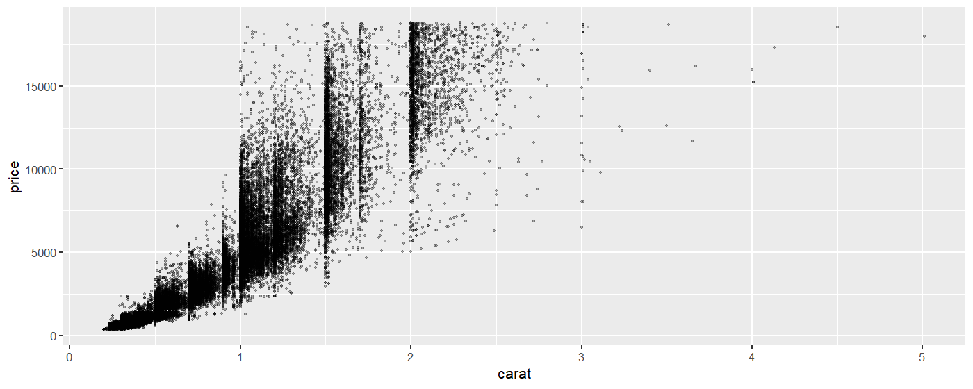
## # ℹ 2 more variables: y <dbl>, z <dbl>It is a data frame of 53,940 diamonds, recording their attributes such as carat, cut, color, clarity, and price.
We will make a scatterplot showing the price as a function of the carat (size). (The data set is large so the plot may take a few moments to generate.)
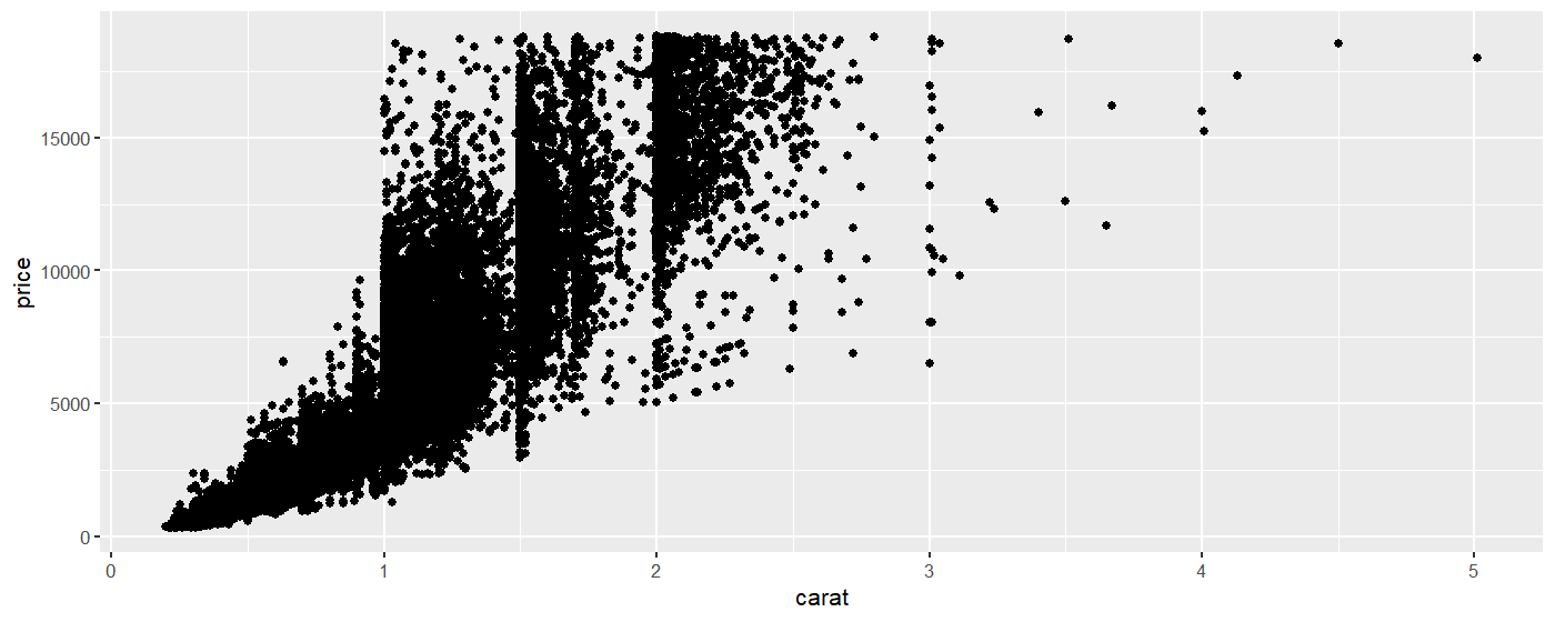
The data set looks a little weird because a lot of diamonds are concentrated on the 1, 1.5 and 2 carat mark.
Let’s take a step back and try to understand the ggplot syntax.
The first thing we did was to define a graphics object,
diamond.plot. This definition told R that we’re using thediamondsdata, and that we want to displaycaraton the x-axis, andpriceon the y-axis.We then called
diamond.plot + geom_point()to get a scatterplot.
The arguments passed to aes() are called mappings. Mappings specify what variables are used for what purpose. When you use geom_point() in the second line, it pulls x, y, colour, size, etc., from the mappings specified in the ggplot() command.
You can also specify some arguments to geom_point directly if you want to specify them for each plot separately instead of pre-specifying a default.
Here we shrink the points to a smaller size, and use the alpha argument to make the points transparent.
If we wanted to let point color depend on the color indicator of the diamond, we could do so in the following way.
diamond.plot <- ggplot(data=diamonds, aes(x=carat, y=price, colour = color))
diamond.plot + geom_point()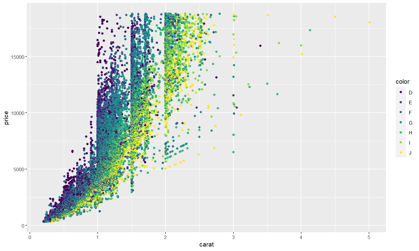
If we didn’t know anything about diamonds going in, this plot would indicate to us that D is likely the highest diamond grade, while J is the lowest grade.
We can change colors by specifying a different color palette. Here’s how we can switch to the cbPalette, which is one of the colorblind-friendly palettes most commonly used in R.
cbPalette <- c("#999999", "#E69F00", "#56B4E9", "#009E73", "#F0E442", "#0072B2", "#D55E00", "#CC79A7")
diamond.plot <- ggplot(data=diamonds, aes(x=carat, y=price, colour = color))
diamond.plot + geom_point() + scale_colour_manual(values=cbPalette)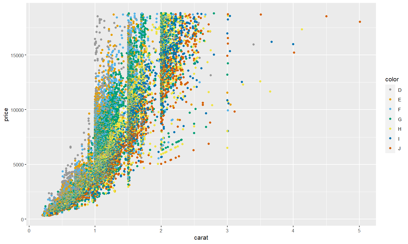
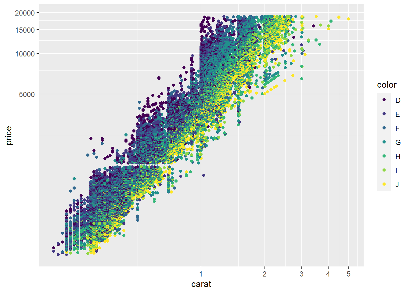
To make the scatterplot look more typical, we can switch to logarithmic coordinate axis spacing.
5.2.5 Conditional plots
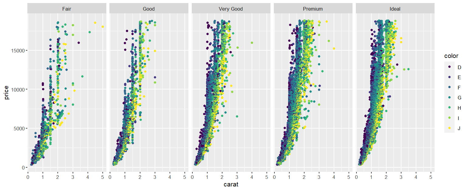
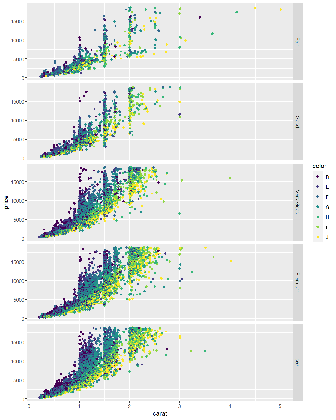
We can create plots showing the relationship between variables across different values of a factor. For instance, here’s a scatterplot showing how diamond price varies with carat size, conditioned on color. It’s created using the facet_wrap(~ factor1 + factor2 + ... + factorn) command.
diamond.plot <- ggplot(data=diamonds, aes(x=carat, y=price, colour = color))

diamond.plot + geom_point() + facet_wrap(~ cut)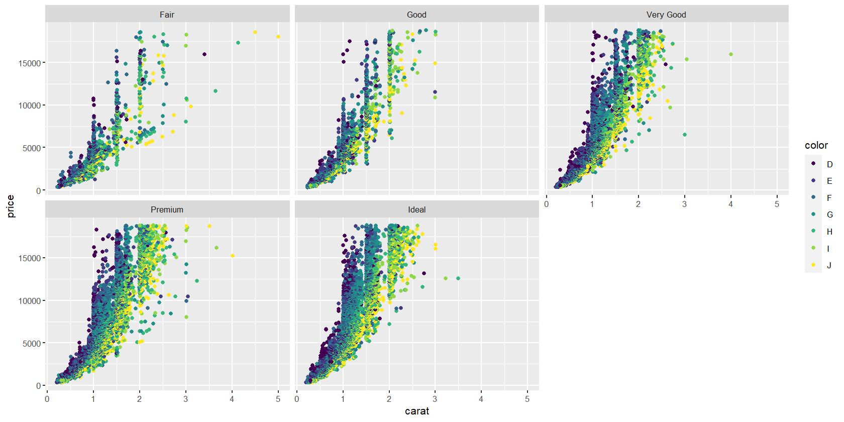
You can also use facet_grid() to produce this type of output.
ggplot can create a lot of different kinds of plots, which are known as geoms or “geometries”. Here are some examples.
| Function | Description |
|---|---|
geom_point(...) |
Points, i.e., scatterplot |
geom_bar(...) |
Bar chart |
geom_line(...) |
Line chart |
geom_boxplot(...) |
Boxplot |
geom_violin(...) |
Violin plot |
geom_density(...) |
Density plot with one variable |
geom_density2d(...) |
Density plot with two variables |
geom_histogram(...) |
Histogram |
5.2.7 Histograms and density plots
base.plot <- ggplot(birthwt, aes(x = mother.age)) +
  xlab("Mother's age")
base.plot + geom_histogram()
## `stat_bin()` using `bins = 30`. Pick better value with
## `binwidth`.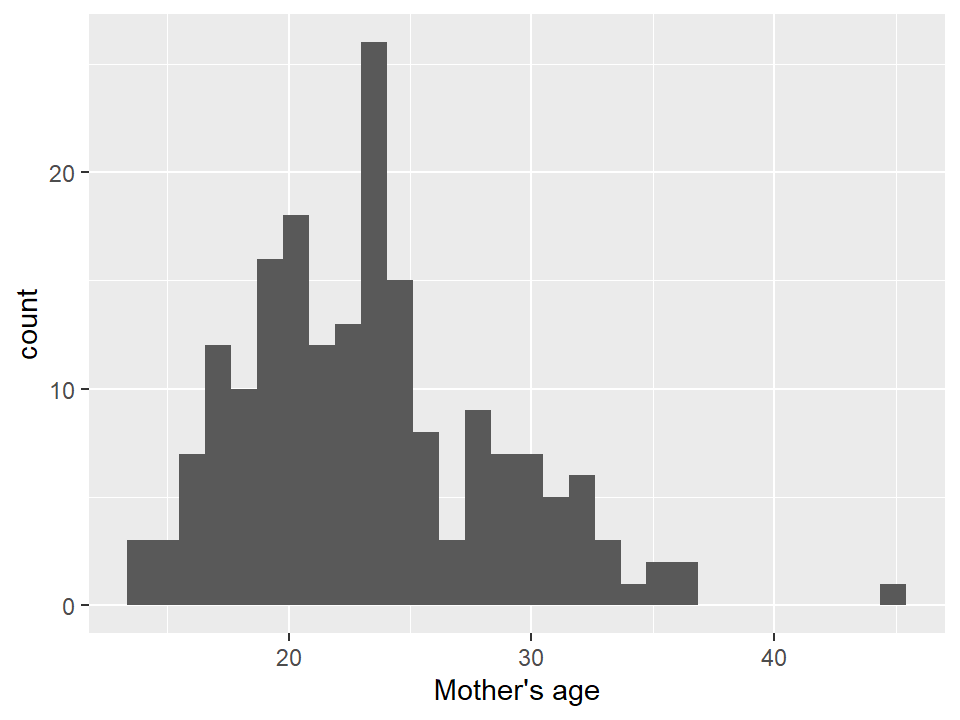
## `stat_bin()` using `bins = 30`. Pick better value with
## `binwidth`.
5.2.8 Box plots and violin plots
base.plot <- ggplot(birthwt, aes(x = as.factor(physician.visits), y = birthwt.grams)) +
  xlab("Number of first trimester physician visits") +
  ylab("Baby's birthweight (grams)")

# Box plot
base.plot + geom_boxplot()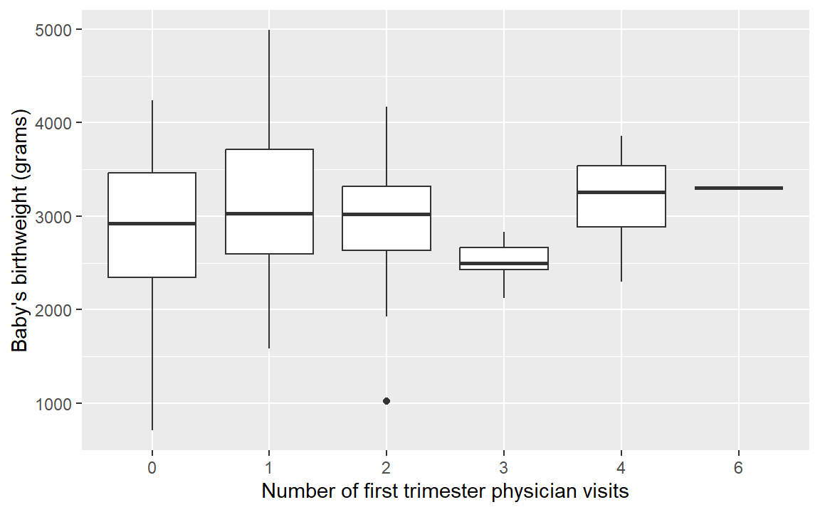
## Warning: Groups with fewer than two data points have been
## dropped.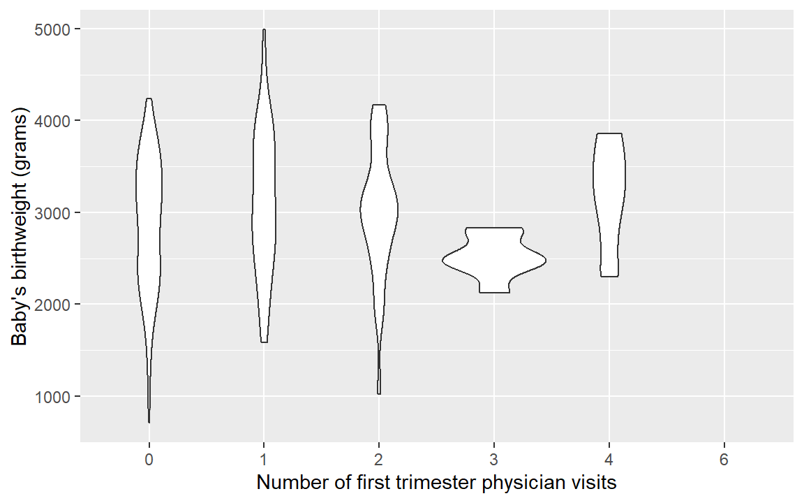
5.2.9 Visualizing means
Previously we calculated the following table:
tbl.mean.bwt <- birthwt %>%
  group_by(race, mother.smokes) %>%
  summarize(mean.birthwt = round(mean(birthwt.grams), 0))
## `summarise()` has grouped output by 'race'. You can
## override using the `.groups` argument.## # A tibble: 6 × 3
## # Groups: race [3]
## race mother.smokes mean.birthwt
## <fct> <fct> <dbl>
## 1 white no 3429
## 2 white yes 2827
## 3 black no 2854
## 4 black yes 2504
## 5 other no 2816
## 6 other yes 2757We can plot this table in a nice bar chart as follows:
# Define basic aesthetic parameters
p.bwt <- ggplot(data = tbl.mean.bwt,
                aes(y = mean.birthwt, x = race, fill = mother.smokes))

# Pick colors for the bars
bwt.colors <- c("#009E73", "#999999")

# Display barchart
p.bwt + geom_bar(stat = "identity", position = "dodge") +
  ylab("Average birthweight") +
  xlab("Mother's race") +
  guides(fill = guide_legend(title = "Mother's smoking status")) +
  scale_fill_manual(values=bwt.colors)
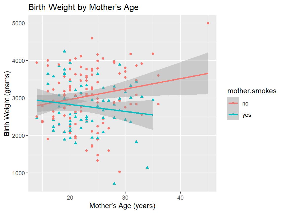
5.2.10 Does the association between birthweight and mother’s age depend on smoking status?
We previously ran the following command to calculate the correlation between mother’s ages and baby birthweights broken down by the mother’s smoking status.
## # A tibble: 2 × 2
##   mother.smokes cor_bwt_age
##   <fct>               <dbl>
## 1 no                  0.201
## 2 yes                -0.144
Here’s a visualization of our data that allows us to see what’s going on.
ggplot(birthwt,
       aes(x=mother.age, y=birthwt.grams, shape=mother.smokes, color=mother.smokes)) +
  geom_point() + # Adds points (scatterplot)
  geom_smooth(method = "lm") + # Adds regression lines
  ylab("Birth Weight (grams)") + # Changes y-axis label
  xlab("Mother's Age (years)") + # Changes x-axis label
  ggtitle("Birth Weight by Mother's Age") # Changes plot title
## `geom_smooth()` using formula = 'y ~ x'