Session-6 Algorithms for Analysis
6.1 Regression
Regression is a statistical technique used in machine learning and statistics to model the relationship between a dependent variable and one or more independent variables. It is primarily used for making predictions or understanding how changes in the independent variables affect the dependent variable.
Types of Regressions and their applications
Linear Regression: For predicting continuous numeric targets.
Logistic Regression: For binary classification or probability estimation.
Polynomial Regression: For modeling nonlinear relationships.
Ridge Regression: For reducing overfitting with L2 regularization.
Lasso Regression: For reducing overfitting with L1 regularization.
Elastic Net Regression: A balance between Ridge and Lasso regularization.
Support Vector Regression (SVR): For predicting with hyperplane fitting.
Decision Tree Regression: For modeling relationships using decision trees.
Random Forest Regression: An ensemble of decision trees for improved accuracy.
Gradient Boosting Regression: An ensemble method for high predictive accuracy.
Time Series Regression: For forecasting future values or trends in time-dependent data.
Bayesian Regression: Incorporating Bayesian statistics for parameter estimation.
Poisson Regression: For modeling count data with a Poisson distribution.
Here’s a breakdown of the key components:
Dependent Variable (DV): This is the variable you want to predict or explain. It’s also called the target variable.
Independent Variables (IV): These are the variables that you believe have an influence on the dependent variable. They are also known as predictor variables or features.
Regression Model: This is a mathematical function that represents the relationship between the dependent and independent variables. The goal is to find the best-fitting model that minimizes the difference between the predicted values and the actual values of the dependent variable.
Why do we use regression?
-Prediction: Regression allows us to make predictions based on historical data. For example, you can predict a house’s price based on features like its size, number of bedrooms, etc.
-Understanding Relationships: Regression helps us understand how different variables are related. It can reveal which variables have a significant impact on the dependent variable and in what direction.
-Hypothesis Testing: Regression can be used to test hypotheses about the relationships between variables.
-Model Validation: Regression models can be used to validate and quantify the strength of relationships and predictions.
6.1.1 Linear Regression:
Linear regression is a specific type of regression analysis used when there’s a linear relationship between the dependent and independent variables. In other words, it assumes that the relationship can be expressed as a straight line equation. Linear regression aims to find the best-fitting linear equation that describes this relationship.
Assumptions of Linear Regression
Linear regression makes several key assumptions about the data and the relationship between the independent (predictor) variables and the dependent (response) variable. Violations of these assumptions can affect the accuracy and reliability of the regression model’s results. The main assumptions of linear regression are as follows:
Linearity: The relationship between the independent variables and the dependent variable is assumed to be linear. In other words, the change in the dependent variable is proportional to changes in the independent variables.
Independence of Errors: The errors (residuals) in the model are assumed to be independent of each other. This means that the error for one data point does not depend on the error for another data point.
Homoscedasticity: The variance of the errors is constant across all levels of the independent variables. In other words, the spread of residuals should be roughly the same for all values of the independent variables.
Normality of Errors: The errors are assumed to be normally distributed. This means that if you were to plot a histogram of the residuals, it should resemble a bell-shaped curve. Normality is particularly important for hypothesis testing and confidence interval estimation.
No or Little Multicollinearity: The independent variables should not be highly correlated with each other (multicollinearity). High multicollinearity can make it difficult to distinguish the individual effects of the independent variables on the dependent variable.
No Endogeneity: There should be no endogeneity, which means that the independent variables are not influenced by the error term. Endogeneity can lead to biased coefficient estimates.
No Autocorrelation (for time series data): In time series data, the residuals should not exhibit autocorrelation, meaning that there should be no systematic patterns in the residuals over time.
No Outliers or Influential Points: Extreme outliers or influential points can disproportionately affect the regression model. It’s important to identify and deal with such data points appropriately.
It’s crucial to assess these assumptions when performing linear regression analysis. Various diagnostic tools and statistical tests are available to check the validity of these assumptions. If the assumptions are violated, corrective actions may be needed, such as data transformation, outlier removal, or using alternative regression techniques like robust regression.
# Define a function for simple linear regression with visualization
simple_linear_regression <- function(x, y) {
  # Calculate the mean of x and y
  mean_x <- mean(x)
  mean_y <- mean(y)

  # Calculate the slope (m) and intercept (b) of the regression line
  numerator <- sum((x - mean_x) * (y - mean_y))
  denominator <- sum((x - mean_x)^2)
  slope <- numerator / denominator
  intercept <- mean_y - slope * mean_x

  # Create a function for the regression line
  predict_linear <- function(x) {
    return (intercept + slope * x)
  }

  # Make predictions
  predicted_y <- predict_linear(x)

  # Calculate the coefficient of determination (R-squared)
  ssr <- sum((predicted_y - mean_y)^2)
  sst <- sum((y - mean_y)^2)
  r_squared <- ssr / sst

  # Plot the data and regression line
  plot(x, y, main = "Simple Linear Regression", xlab = "X", ylab = "Y")
  abline(a = intercept, b = slope, col = "red")

  # Return the regression results
  results <- list(
    slope = slope,
    intercept = intercept,
    predicted_y = predicted_y,
    r_squared = r_squared
  )

  return(results)
}

# Example usage:
x <- mtcars$cyl
y <- mtcars$mpg
regression_results <- simple_linear_regression(x, y)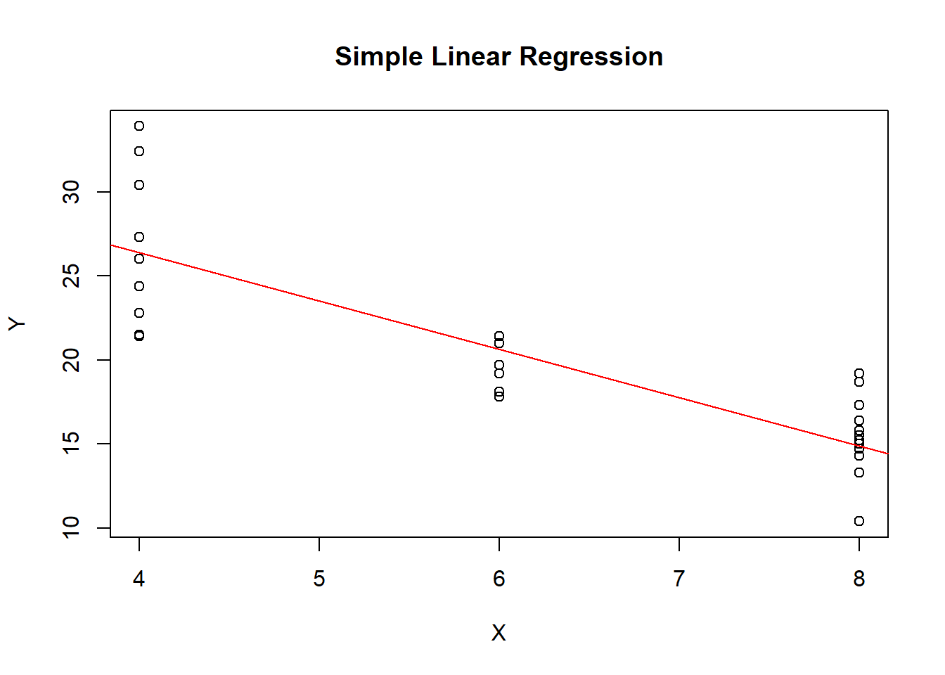
## $slope
## [1] -2.876
##
## $intercept
## [1] 37.88
##
## $predicted_y
##  [1] 20.63 20.63 26.38 20.63 14.88 20.63 14.88 26.38
##  [9] 26.38 20.63 20.63 14.88 14.88 14.88 14.88 14.88
## [17] 14.88 26.38 26.38 26.38 26.38 14.88 14.88 14.88
## [25] 14.88 26.38 26.38 26.38 14.88 20.63 14.88 26.38
##
## $r_squared
## [1] 0.7262
Slope (Coefficient for x):
The slope represents the change in the dependent variable (y) for a one-unit change in the independent variable (x). In the context of the example provided, if the number of cylinders (cyl) in a car increases by one unit, the miles per gallon (mpg) is expected to change by the value of the slope. For example, if the slope is -2.5, it means that for each additional cylinder, the car’s fuel efficiency (mpg) is expected to decrease by 2.5 miles per gallon.
Intercept:
The intercept represents the predicted value of the dependent variable (y) when the independent variable (x) is equal to zero. However, in many real-world scenarios, this interpretation may not be meaningful because zero on the x-axis may not correspond to a meaningful point in the data. In the context of the example, the intercept represents the predicted miles per gallon (mpg) when there are zero cylinders, but this interpretation may not be practically meaningful for cars.
Coefficient of Determination (R-squared):
R-squared is a measure of how well the regression line fits the data. It represents the proportion of the variance in the dependent variable (y) that is explained by the independent variable (x). An R-squared value closer to 1 indicates that the model explains a large portion of the variance in the data, suggesting a good fit. An R-squared value closer to 0 indicates a poor fit.
In the context of the example, if the R-squared is, for instance, 0.72, it means that 72% of the variability in miles per gallon (mpg) can be explained by the number of cylinders (cyl). The remaining 28% is unexplained and may be due to other factors not included in the model.
6.2 K-Nearest Neighbours
K-Nearest Neighbors (K-NN) is a supervised machine learning algorithm used for both classification and regression tasks. It’s a non-parametric and instance-based learning algorithm, meaning it doesn’t make explicit assumptions about the underlying data distribution and relies on the entire dataset during training. K-NN is simple to understand and implement, making it a popular choice for beginners in machine learning.
Here’s how K-NN works:
Data Preparation: Start with a labeled dataset where each data point has a set of features and a corresponding class label (for classification) or a target value (for regression).
Choosing K: Select a positive integer value for K, which represents the number of nearest neighbors to consider when making a prediction. The choice of K is a hyperparameter that can affect the model’s performance.
Distance Metric: Choose a distance metric (e.g., Euclidean distance, Manhattan distance) to measure the similarity or dissimilarity between data points. Commonly used distance metrics include Euclidean distance and Manhattan distance.
Prediction:
- For Classification: Given a new data point, K-NN finds the K training examples with the closest feature values (nearest neighbors) based on the chosen distance metric. It then assigns the class label that is most frequent among these K neighbors to the new data point.
- For Regression: Instead of assigning class labels, K-NN predicts a continuous value as the average or weighted average of the target values of its K nearest neighbors.
Evaluation: Evaluate the performance of the K-NN model using appropriate metrics such as accuracy, precision, recall, F1-score (for classification), or mean squared error (for regression).
Tuning Hyperparameters: Experiment with different values of K and distance metrics to find the combination that provides the best performance on your dataset. This often involves using cross-validation techniques.
Key characteristics of K-NN:
Lazy Learner: K-NN is a lazy learner because it doesn’t learn a fixed model during training. Instead, it stores the entire training dataset and performs computations during prediction.
No Model Assumptions: K-NN makes no assumptions about the underlying data distribution, which can be an advantage when dealing with complex or non-linear data.
Sensitive to Distance Metric and K: The choice of distance metric and the value of K can significantly impact the algorithm’s performance. Selecting appropriate values is often done through experimentation.
Curse of Dimensionality: K-NN can be sensitive to the curse of dimensionality, where the algorithm’s performance degrades as the number of features or dimensions increases. Feature selection or dimensionality reduction techniques may be necessary.
K-NN is used in various applications, including recommendation systems, image classification, anomaly detection, and more. It’s especially useful when the decision boundaries between classes are complex or non-linear.
Choosing K
Choosing the best value of k in K-Nearest Neighbors (K-NN) is a critical step in the modeling process. The choice of k can significantly impact the performance of your K-NN classifier. Here are some common methods and strategies for selecting the best k:
Grid Search: You can perform a grid search over a range of
kvalues and evaluate the performance of your K-NN classifier using a validation dataset or cross-validation. Choose thekthat yields the best performance metric (e.g., accuracy, F1-score, or other relevant metrics). Here’s an example in R using cross-validation:Odd vs. Even
k: It’s common to prefer odd values ofk, especially when dealing with binary classification problems. Odd values ofkcan help avoid ties when voting for class labels.Domain Knowledge: Consider any prior knowledge or domain expertise you have about the problem. Sometimes, domain-specific insights can guide the selection of an appropriate
k.Visualization: Visualize the decision boundaries for different
kvalues and observe how they impact the classification. You can create plots like the one shown in the previous response to gain insights into the behavior of the classifier.Bias-Variance Trade-off: Smaller values of
k(e.g., 1 or 3) tend to result in a more flexible model with high variance but low bias. Larger values ofk(e.g., 10 or 20) lead to a smoother decision boundary with low variance but potentially higher bias. Consider the trade-off between bias and variance when choosingk.Cross-Validation: Use cross-validation techniques, such as k-fold cross-validation, to assess the performance of the model for different
kvalues. Cross-validation provides a more robust estimate of how well the model generalizes to unseen data.Testing Multiple Metrics: Instead of relying solely on accuracy, consider other performance metrics like precision, recall, F1-score, or ROC AUC if they are more relevant to your problem. Different
kvalues may perform differently based on the chosen metric.Experiment: Don’t hesitate to experiment with different
kvalues and observe their impact on your specific dataset. The “best”kcan vary from one dataset to another.Automated Methods: You can also explore automated methods, such as algorithms for hyperparameter optimization, like Bayesian optimization or random search.
Remember that there is no one-size-fits-all rule for choosing k. The optimal value of k depends on the nature of your data, the problem at hand, and the trade-offs you are willing to make between bias and variance. Experimentation and validation on your specific dataset are key to making an informed choice.
Algorithm in action
## Loading required package: lattice##
## Attaching package: 'caret'## The following object is masked from 'package:purrr':
##
## liftlibrary(ggplot2)
# Load the mtcars dataset
data(mtcars)
# Define a function to convert mpg to binary labels
convert_to_binary <- function(mpg) {
ifelse(mpg >= median(mtcars$mpg), "High", "Low")
}
# Add a new column 'mileage' with binary labels
mtcars$mileage <- convert_to_binary(mtcars$mpg)
# Split the dataset into training and testing sets
set.seed(123)
sample_size <- floor(0.7 * nrow(mtcars))
train_indices <- sample(1:nrow(mtcars), size = sample_size)
train_data <- mtcars[train_indices, ]
test_data <- mtcars[-train_indices, ]
# Define the predictor variable and target variable
predictor_vars <- train_data[c("mpg", "hp", "wt")]
target_var <- train_data$mileage
# Define a grid of k values to search over
k_values <- seq(1, 20, by = 1)
# Create a train control for cross-validation
ctrl <- trainControl(method = "cv", number = 10)
# Perform grid search with cross-validation
grid_search <- train(
x = predictor_vars,
y = target_var,
method = "knn",
trControl = ctrl,
tuneGrid = data.frame(k = k_values)
)
# Get the best k value
best_k <- grid_search$bestTune$k
print(paste("Best k:", best_k))## [1] "Best k: 12"# Fit the K-NN model with the best k value on the entire training data
knn_model <- knn(train = predictor_vars, test = test_data[c("mpg", "hp", "wt")], cl = target_var, k = best_k)
# Evaluate the model on the test data
accuracy <- sum(knn_model == test_data$mileage) / length(knn_model)
print(paste("Accuracy:", round(accuracy * 100, 2), "%"))## [1] "Accuracy: 80 %"# Visualize the decision boundary
ggplot(mtcars, aes(x = mpg, y = hp, color = mileage)) +
geom_point() +
geom_point(data = test_data, aes(x = mpg, y = hp), size = 3, shape = 4, color = "black") +
geom_contour(aes(x = mpg, y = hp, z = as.numeric(mileage)), bins = 1, alpha = 0.5) +
scale_color_manual(values = c("High" = "green", "Low" = "red")) +
labs(title = "K-NN Classification on mtcars",
x = "Miles per Gallon (mpg)",
y = "Horsepower (hp)") +
theme_minimal()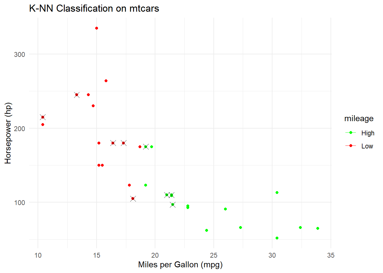
6.3 K-Means
K-Means is a popular unsupervised machine learning algorithm used for clustering similar data points into groups or clusters based on their feature similarity. The primary goal of K-Means is to partition the data into K clusters, with each cluster represented by a centroid (center point). Data points within the same cluster are more similar to each other and less similar to data points in other clusters.
Here’s how K-Means works:
Initialization: Choose the number of clusters, K, that you want to partition the data into. Randomly initialize K cluster centroids in the feature space.
Assignment Step (Expectation):
- For each data point, calculate the distance between the point and each of the K centroids (usually using Euclidean distance).
- Assign the data point to the cluster whose centroid is the closest (i.e., the data point becomes a member of that cluster).
Update Step (Maximization):
- Recalculate the centroids of each cluster by taking the mean of all data points assigned to that cluster.
- The new centroids represent the updated center points of the clusters.
Repeat Steps 2 and 3:
- Reassign data points to clusters based on the updated centroids.
- Recalculate the centroids based on the new cluster assignments.
- Repeat these steps until convergence criteria are met (e.g., when centroids no longer change significantly or after a fixed number of iterations).
Output:
- The final cluster assignments, where each data point belongs to one of the K clusters.
- The centroids of the clusters, which represent the center points of the clusters.
Key characteristics of K-Means:
K-Means aims to minimize the inertia (within-cluster sum of squares) by finding the optimal cluster centroids that minimize the distance between data points and their assigned centroids.
K-Means is sensitive to the initial placement of centroids, so multiple runs with different initializations are often performed to mitigate this issue (K-Means++ is a common initialization strategy).
The number of clusters, K, is a hyperparameter that needs to be specified in advance, and choosing the right K can be challenging. Various methods, such as the elbow method and silhouette analysis, can help determine an appropriate K value.
K-Means is suitable for data with well-defined and compact clusters, but it may struggle with non-convex clusters, clusters of varying sizes, and noisy data.
It is an efficient and scalable algorithm, making it suitable for large datasets.
K-Means has applications in various fields, including image compression, customer segmentation, anomaly detection, and recommendation systems.
Overall, K-Means is a widely used clustering algorithm that can help discover patterns and structure in data by grouping similar data points into clusters.
Asumptions of K-Means
K-Means is a powerful clustering algorithm, but it makes certain assumptions about the data and the nature of clusters. Understanding these assumptions can help you use K-Means effectively and interpret its results. Here are the key assumptions of K-Means:
Cluster Shape: K-Means assumes that clusters are spherical, meaning they are roughly spherical in shape and have a similar size. This assumption can be limiting when dealing with clusters that have non-spherical shapes, irregular shapes, or varying sizes.
Cluster Density: K-Means assumes that clusters have roughly similar densities, meaning the number of data points in a cluster is roughly uniform. This assumption may not hold when clusters have varying densities.
Cluster Separation: K-Means assumes that clusters are well-separated, and data points within one cluster are significantly closer to each other than to data points in other clusters. In cases where clusters overlap, K-Means may struggle to correctly identify cluster boundaries.
Equal Variance: K-Means assumes that the variance of each variable (feature) is the same for all clusters. If there are clusters with significantly different variances in their features, K-Means may not perform well.
Noisy Data: K-Means assumes that data points are not noisy and that any deviations from cluster centroids are due to cluster structure. Outliers and noisy data points can significantly impact K-Means results.
Linear Separability: K-Means is a distance-based algorithm and assumes that data points can be separated into clusters using Euclidean distance or other distance metrics. It may not perform well on data with non-linear separability.
Fixed Number of Clusters (K): K-Means requires the user to specify the number of clusters (K) in advance. Choosing an inappropriate K value can lead to suboptimal results.
Initialization Sensitivity: K-Means is sensitive to the initial placement of cluster centroids. Different initializations can lead to different final clustering results. Common initialization methods, like K-Means++, aim to mitigate this sensitivity.
Convergence: K-Means assumes that the algorithm will converge to a solution, but convergence is not guaranteed. The algorithm may converge to a local minimum, which may not be the optimal clustering.
Data Scaling: K-Means is sensitive to the scale of features. Features with larger scales can dominate the clustering process. It’s often necessary to standardize or normalize features before applying K-Means.
It’s important to keep these assumptions in mind when using K-Means and to assess whether they hold for your specific dataset. If some of these assumptions are violated, alternative clustering methods or preprocessing techniques may be more appropriate. Additionally, evaluating the quality of the clustering results and using validation measures can help assess the validity of the assumptions in practice.
Choosing value of K
Choosing the appropriate value of K, the number of clusters, in K-Means clustering is a crucial step, as it can significantly impact the quality of the clustering results. Here are several methods and strategies to help you choose the right K for your dataset:
- Elbow Method:
- The elbow method involves plotting the within-cluster sum of squares (inertia) as a function of the number of clusters K. Inertia measures how compact the clusters are; smaller inertia values indicate more compact clusters.
- As K increases, inertia tends to decrease because smaller clusters are formed. However, beyond a certain point, increasing K results in diminishing returns in terms of reducing inertia.
- Look for the “elbow” point in the plot, where the rate of decrease in inertia starts to slow down. The K at which this occurs can be a good choice.
- Silhouette Score:
- The silhouette score measures the quality of clustering, considering both cohesion (average distance within clusters) and separation (average distance between clusters).
- Calculate the silhouette score for different K values and choose the K with the highest silhouette score. Higher silhouette scores indicate better-defined clusters.
- Gap Statistics:
- Gap statistics compare the clustering quality of your data to that of a random dataset. It quantifies the difference between the intra-cluster distances in your data and those in random data.
- Compute gap statistics for various K values and choose the K that maximizes the gap, indicating better clustering than random data.
- Dendrogram:
- Hierarchical clustering methods, such as agglomerative clustering, produce dendrograms that visualize the hierarchical structure of clusters. You can cut the dendrogram at a certain level to determine the number of clusters.
- Observe where the dendrogram branches apart; this can suggest an appropriate K value.
- Domain Knowledge:
- If you have prior knowledge or domain expertise about the data, it can guide your choice of K. Subject-matter expertise may suggest a reasonable range for K based on the underlying structure of the data.
- Visualization:
- Visualize the data and potential clusters. Scatterplots, heatmaps, or other visualization techniques can provide insights into the natural grouping of data points.
- Cross-Validation:
- Use cross-validation to assess the stability and generalization of your clustering results for different K values. Cross-validation can help you choose a K that produces consistent and robust clusters.
- Incremental K-Means:
- Start with a small K and incrementally increase it, monitoring how the clustering results change. Stop when further increasing K does not yield more meaningful clusters.
- Business or Research Goals:
- Consider the practical application of clustering. Sometimes, the choice of K may be influenced by specific business or research goals, such as segmenting customers for targeted marketing.
- Experimentation:
- Don’t be afraid to experiment with different K values and assess the quality of clustering results using various metrics and visualization techniques.
Keep in mind that there is no one-size-fits-all method for choosing K, and different methods may suggest different values. It’s often beneficial to combine multiple approaches and rely on a combination of quantitative metrics and qualitative insights to make an informed decision about the number of clusters that best represent your data.
The Elbow Method is a popular technique for choosing the best value of K (number of clusters) in K-Means clustering. It involves plotting the within-cluster sum of squares (inertia) for a range of K values and looking for the “elbow” point, where the inertia starts to level off. Let’s implement the Elbow Method for clustering the mtcars dataset using K-Means and visualize the results:
# Load necessary libraries
library(ggplot2)
library(cluster)

# Load the mtcars dataset
data(mtcars)

# Select the features for clustering
features <- mtcars[, c("mpg", "hp")]

# Perform K-Means clustering for a range of K values
k_values <- 1:10  # Range of K values to explore
inertia <- numeric(length(k_values))

for (k in k_values) {
  kmeans_model <- kmeans(features, centers = k, nstart = 10)
  inertia[k] <- kmeans_model$tot.withinss
}

# Plot the Elbow Method to choose the best K
elbow_plot <- data.frame(K = k_values, Inertia = inertia)

ggplot(elbow_plot, aes(x = K, y = Inertia)) +
  geom_line() +
  geom_point() +
  labs(title = "Elbow Method for K-Means Clustering on mtcars",
       x = "Number of Clusters (K)",
       y = "Within-Cluster Sum of Squares (Inertia)") +
  theme_minimal()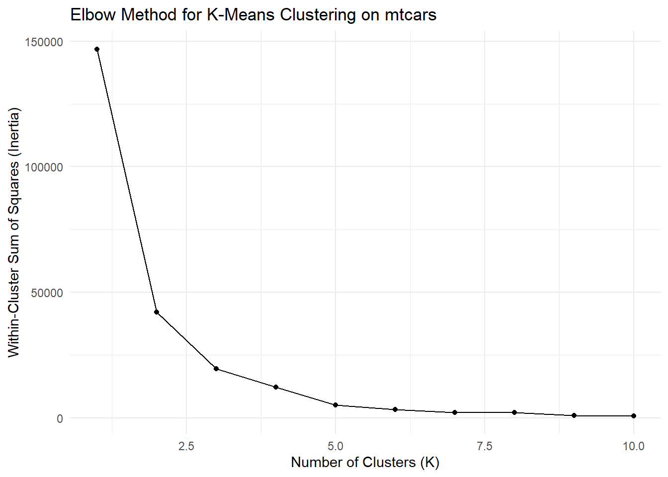
# Based on the plot, choose the best K value
best_k <- 3  # Replace with the selected K value

# Perform K-Means clustering with the best K
best_kmeans_model <- kmeans(features, centers = best_k, nstart = 10)

# Add cluster assignments to the mtcars dataset
mtcars$cluster <- as.factor(best_kmeans_model$cluster)

# Visualize the clusters
ggplot(mtcars, aes(x = mpg, y = hp, color = cluster)) +
  geom_point() +
  labs(title = "K-Means Clustering on mtcars (K = 3)",
       x = "Miles per Gallon (mpg)",
       y = "Horsepower (hp)") +
  theme_minimal()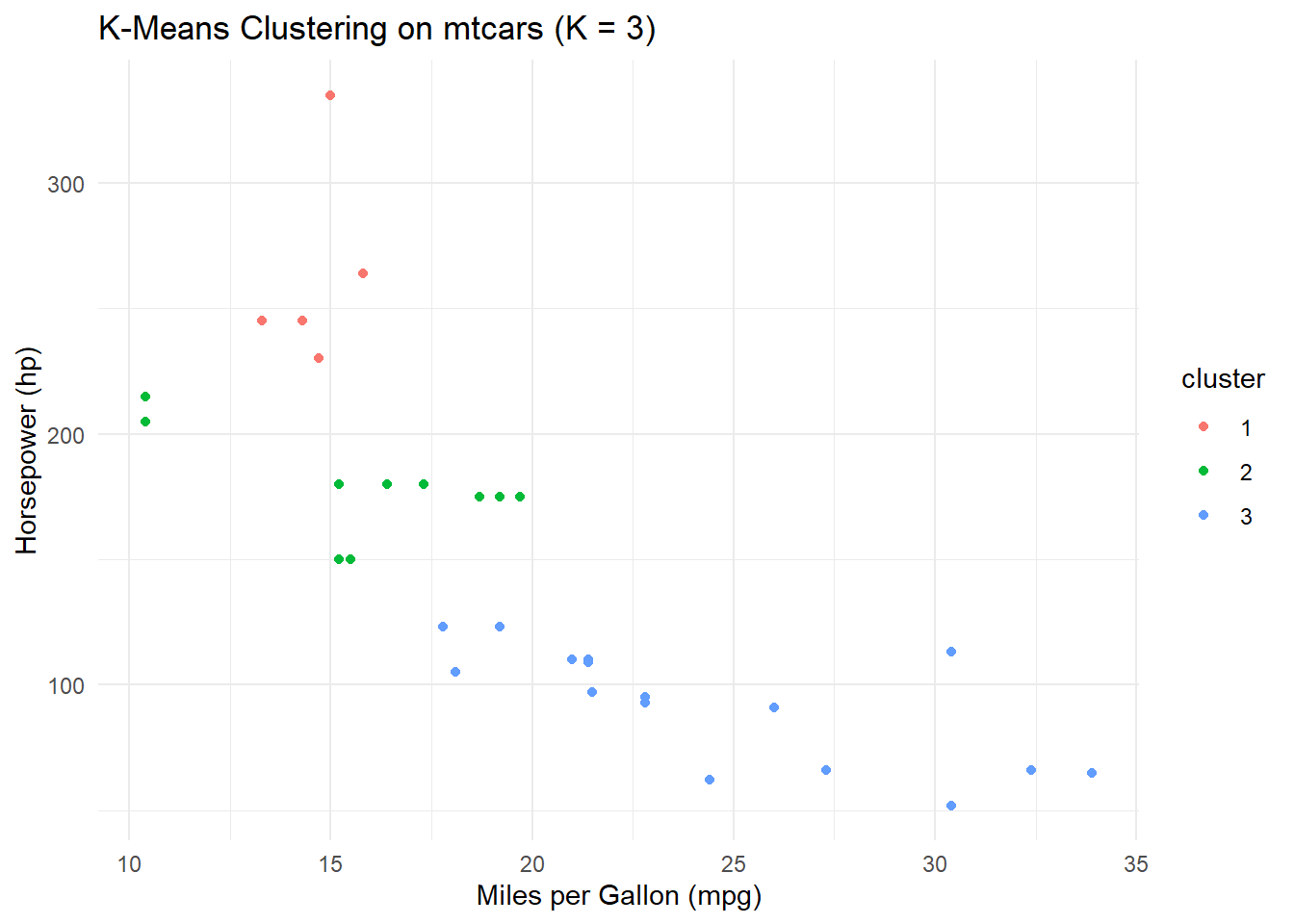
In this code:
We load the necessary libraries, including
ggplot2andcluster, and load themtcarsdataset.We select the features (
mpgandhp) for clustering.We perform K-Means clustering for a range of K values (from 1 to 10) and calculate the inertia for each K value.
We plot the Elbow Method, which shows the inertia values for different K values. The “elbow” point in the plot is where the inertia starts to level off. We choose this K value as the best K.
We perform K-Means clustering again with the best K value and assign cluster labels to the
mtcarsdataset.Finally, we visualize the clusters in a scatterplot, where each point is colored based on its cluster assignment.
Interpretation:
In the Elbow Method plot, observe the point where the inertia starts to level off. In this case, it appears that K = 3 could be a reasonable choice as the “elbow” point.
The scatterplot visualizes the clusters, showing how the K-Means algorithm has grouped data points based on the
mpgandhpfeatures.
You can adjust the range of K values and explore other features for clustering to fine-tune the K-Means model based on your specific dataset and requirements.